Client: Career Pathway Institute
My Role: UX Writer
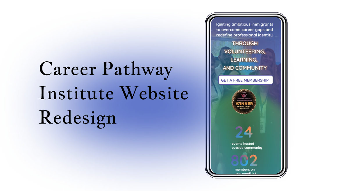
Focus: Hero Section Redesign (Part of a broader website overhaul)
My Role: UX Writer
Focus: Hero Section Redesign (Part of a broader website overhaul)
Team: CEO, Marketing Department, Creative Director, UX Writer
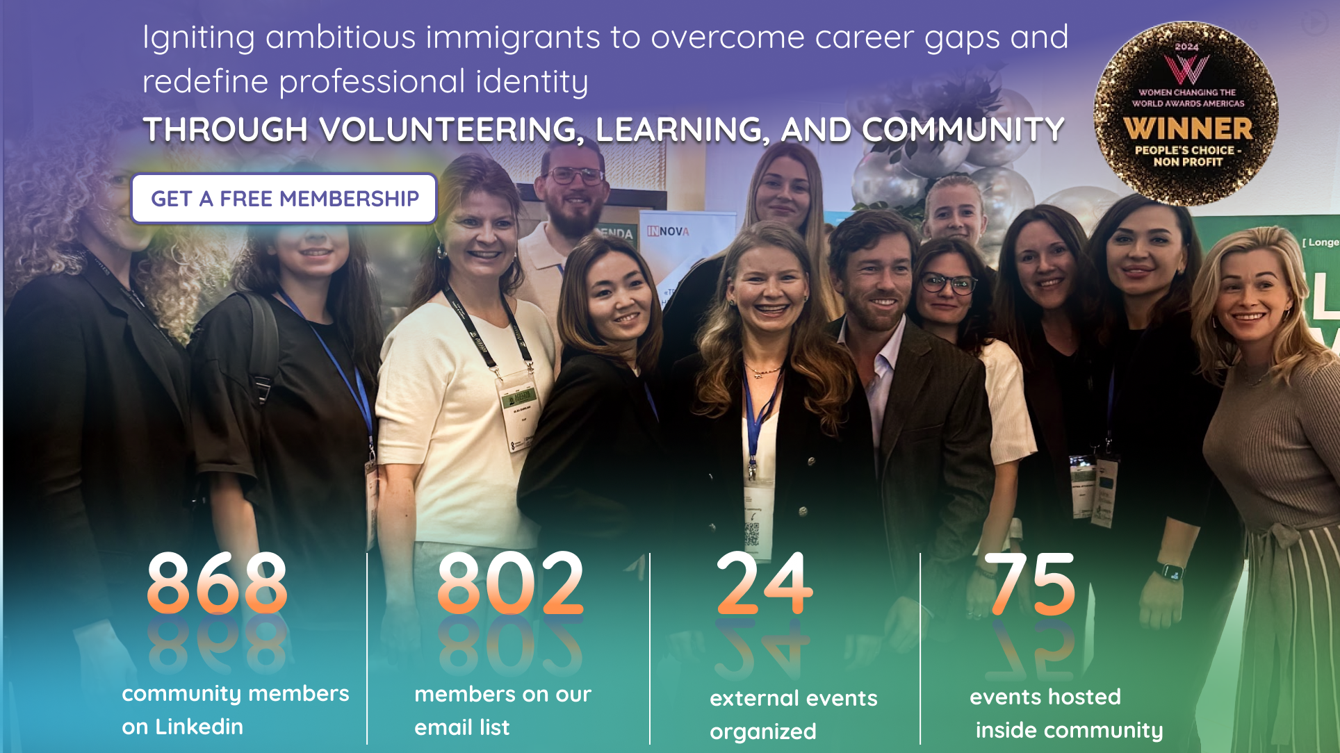
This was an early step in a full website redesign. I started with the hero section because the existing one didn’t represent the organization well. The image was generic, and the message was vague and uninspiring.
Key activities
►Competitive Analysis
►User Surveys
►Prototype & writing
User Testing Insights
✏︎ Users were confused about “community” — no explanation was provided
✏︎ Some assumed “Apply” meant paid membership
✏︎ Users misunderstood volunteering — often confused with paid roles
✏︎ Many assumed CPI could help find jobs or offer work permits
Problems Identified
Problem 1: The four buttons in the hero section made it unclear what the organization’s primary action was, and didn’t effectively speak to the target users.
Problem 2: Users didn’t clearly understand what kind of help CPI offers or whether services were free or paid.
Solution
Storytelling in the header:
I crafted a short narrative to build empathy by illustrating the journey of a dependent immigrant arriving in the U.S. It added warmth and relatability.
I crafted a short narrative to build empathy by illustrating the journey of a dependent immigrant arriving in the U.S. It added warmth and relatability.
Clarified calls to action:
I removed clutter by keeping only two buttons:
I removed clutter by keeping only two buttons:
►Donate
►Join the Community
Reorganized supporting content:
Other opportunities and actions were explained and relocated just below the hero section, reducing cognitive load.
Other opportunities and actions were explained and relocated just below the hero section, reducing cognitive load.
Design Collaboration & UI Constraints
Due to platform limitations (Wix), we had to work within existing layout structures. This required highly intentional microcopy—ensuring each word delivered clarity and direction. I partnered with Creative Designer Ashlesha Navale to co-create a visual-content alignment that emphasized story, trust, and hierarchy.
Voice & Tone
To meet the emotional and practical needs of immigrants building a career in a new country, I used a tone that was:
Empowering – inspiring action and identity rebuilding
Supportive – clear, non-jargony language for non-native speakers
Reassuring – clarifying what’s free and how to engage
Optimistic – conveying CPI’s growth, community, and success stories
Creative process
After conducting user interviews, I synthesized the insights into three user story concepts. To bring these narratives to life, I translated them into first-person imagined quotes from typical users. This helped internal stakeholders visualize real motivations and pain points—and allowed me to frame the hero section and CTAs with more empathy and clarity.
Evolution & Reflection
This version was an intermediate step. After further product research, the board decided to expand the target audience from dependent visa holders to all highly skilled immigrants seeking U.S. career opportunities. As a result, the hero section evolved again to reflect this broader mission.
Still, this version remains one of my favorite contributions—both for its storytelling and its role in improving clarity, empathy, and engagement.


