
Project Overview
Client: Career Pathway Institute (Nonprofit based in the San Francisco Bay Area)
Target Audience: Highly skilled immigrants seeking career opportunities in the U.S.
My Role: UX Designer & Content Strategist
Team: CEO, marketing team, creative director, developer
Platform: Wix (limited customization)
Tools: Figma, Miro, Google Docs
Target Audience: Highly skilled immigrants seeking career opportunities in the U.S.
My Role: UX Designer & Content Strategist
Team: CEO, marketing team, creative director, developer
Platform: Wix (limited customization)
Tools: Figma, Miro, Google Docs
Key Results
- Bounce rate dropped by 40% on the homepage
- 250+ new users joined the community in the first month post-launch
The Challenge
▶︎Outdated content and navigation
▶︎New positioning (now serving all highly skilled immigrants)
▶︎No clear space to promote new programs/events
▶︎Limited UI capabilities (Wix platform)
▶︎No defined user flows or primary CTA
Process Overview
▶︎Stakeholder interviews
▶︎Content & IA audit
▶︎Sitemap and card sorting
▶︎Remote usability testing (8 users)
▶︎UX writing & homepage redesign
Key Problems Identified
✏︎ Generic hero section — unclear image, vague tagline
✏︎ Too many buttons on the first screen (5 with no hierarchy)
✏︎ Unclear audience — immigrants, donors, or volunteers?
✏︎ Ambiguous copy — users didn’t understand what CPI offered
✏︎ The donate section lacked problem framing or context

User Testing Insights
✏︎ Users were confused about “community” — no explanation was provided
✏︎ Some assumed “Apply” meant paid membership
✏︎ Users misunderstood volunteering — often confused with paid roles
✏︎ Many assumed CPI could help find jobs or offer work permits
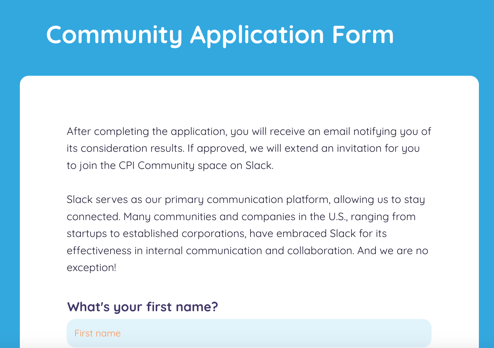
The button "Join a community" leads directly to the questionnaire, and there are no explanations about the community
Competitive Analysis Takeaways
✏︎ Top-performing nonprofits focus on 1–2 strong CTAs
✏︎ Real photos in hero sections build trust
✏︎ Content for donors/sponsors lives on separate pages
✏︎ Clear, benefit-driven language is essential

Recommendations to the Board
✏︎ Use one clear CTA: “Get a Free Membership”
✏︎ Rework hero image with real team photo and clear message
✏︎ Highlight events and podcasts near the top of the homepage
✏︎ Create a dedicated community page
✏︎ Categorize content by user benefit
✏︎ Add organization stats (events held, people helped)
✏︎ Clarify the value and pricing of services
Final IA and Content Structure
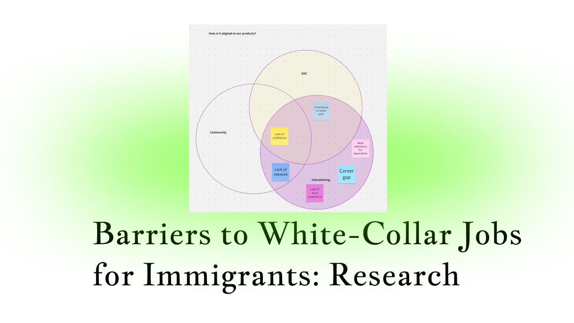
We conducted a collaborative card-sorting session with the team and identified 3 core categories:
⏎ Design Your Career (The flagman program)
⏎ Community Events
⏎Volunteering Opportunities
Other content was reorganized or rebranded:
- Past events → Podcast
- Paid events are promoted just below the fold
- Volunteer opportunities emphasized as skilled, meaningful, and flexible

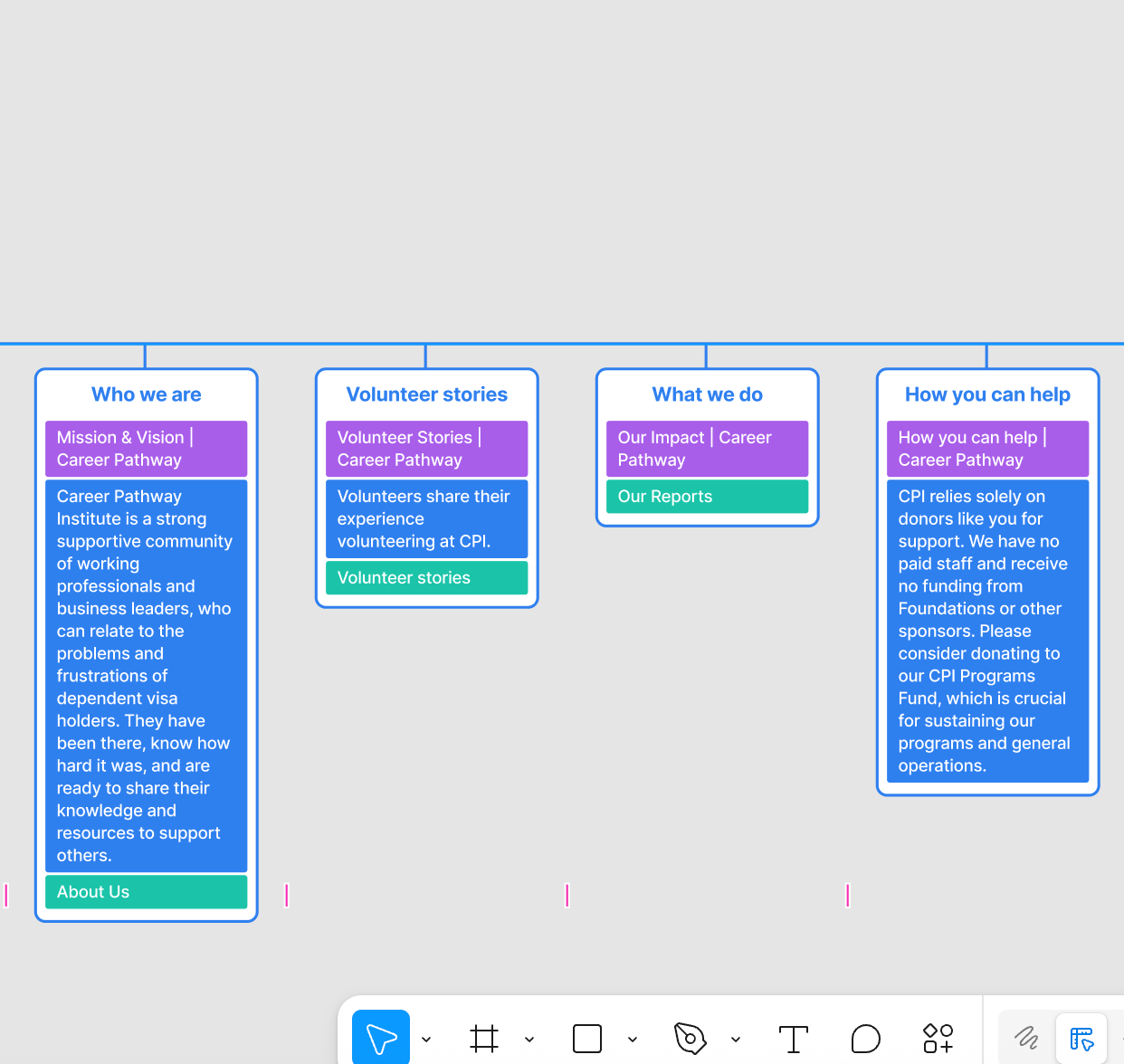


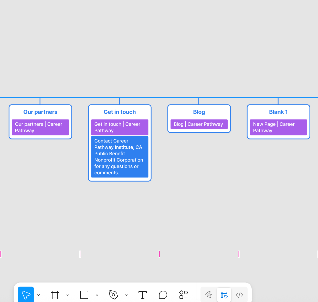
The navigation was too complicated, with much outdated information, old programs, and repetitive content
The navigation was simplified

New simplified site map

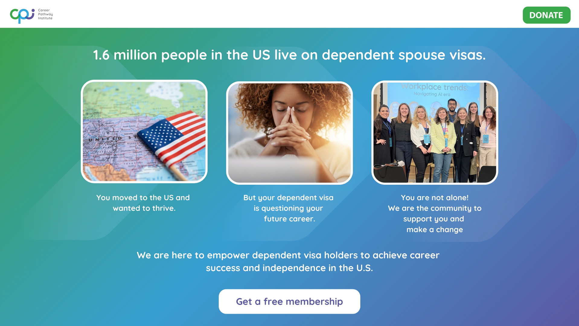
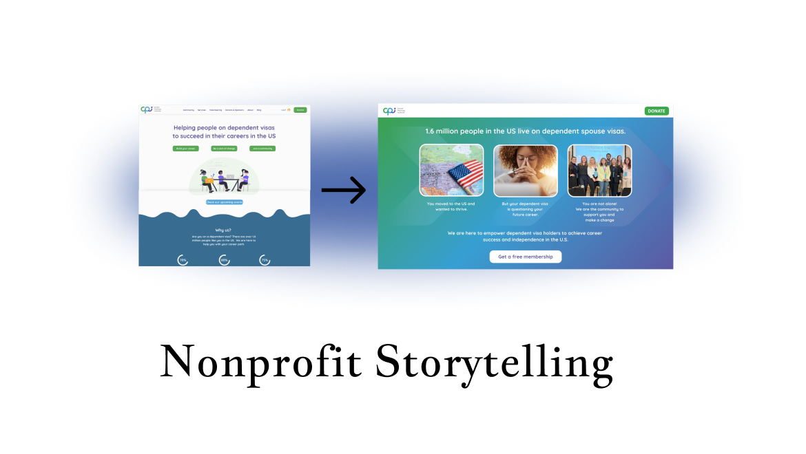
Storytelling + Hero Update
We revised the hero to reflect CPI’s expanded mission:
From “supporting dependent visa holders” → to “empowering all immigrants to rebuild their careers.”
From “supporting dependent visa holders” → to “empowering all immigrants to rebuild their careers.”
New hero includes:
Clearer copy
Proof of impact (e.g., # of events, community size)
One real, high-quality team photo
Strong CTA: “Get a Free Membership”

Styles and colors were adjusted to match the branding used in social media and described in the brandbook.
About the hero copy
The original hero copy was:
"Helping people on dependent visas to succeed in their careers in the US"
While short, this line lacked detail about who CPI helps, how they help, and what makes their support unique.
Through research and testing, I found that many users misunderstood the organization's offer, confused volunteering with paid work, and didn’t recognize the community as a free opportunity. To address this, I expanded the hero message into:
"Igniting ambitious immigrants to overcome career gaps and redefine professional identity through volunteering, learning, and community."
Although longer, this version:
✏︎ Clarifies the target audience (ambitious immigrants)
✏︎ Names key support channels (volunteering, learning, community)
✏︎ Uses emotional and empowering language to reflect the organization’s mission
This rewrite was a deliberate UX decision aimed at enhancing clarity and motivation, and it was thoroughly tested during validation.
New pages were created to tell more about the community, mission, the story of the non-profit, and specific programs.


The Outcome
▶︎Homepage bounce rate dropped by 40%
▶︎250+ new users joined the community in the first month
▶︎Users better understood CPI’s services and who they are for
▶︎Navigation and content structure became intuitive and goal-oriented
Reflection
This project taught me the value of:
✏︎ Writing clearly for multilingual, multicultural users
✏︎ Collaborating with stakeholders in resource-limited environments
✏︎ Designing scalable UX copy and content structures
✏︎ Always clarifying value, pricing, and expectations for users who may feel vulnerable or uncertain