Client: Atlas Biomed RU. The company provides DNA and Microbiome tests.
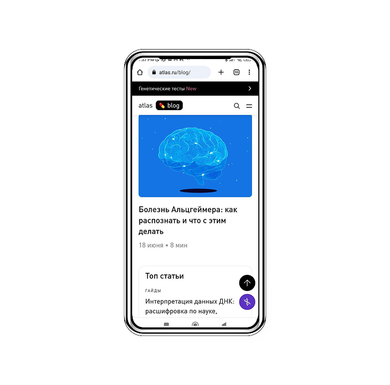
Problem: The company has a successful blog about healthcare, but the blog doesn't give any conversions to test sales, even though many advertising banners are added to texts.
The initial version of the blog page had two buttons with a link to the main page of the DNA test website.
Research:
Responders: 10 males, 14 females, 27-35 years old, Senior specialists. The choice was based on the company audience segmentation.
1. I conducted a mini-usability test and asked users to read a couple of articles from the blog. Then I asked them to tell me what they remembered about the test. Most of them said that tests were good for understanding health issues.
2. Then I asked to find the information about the test in the blog, and most of the respondents started to open the articles and watch for the banners.
3. So I asked why they didn't just click the button "Learn more" or "Buy test," and the answer was that they didn't want to go to the card if they chose "Buy test", and nobody understood that "Learn more" will lead to the test information.
4. I conducted an unmoderated usability test with more users to check the hypothesis that we need a button with more explicit text. Still, the result was the same - most users were sure that any button would lead to the card or the main page.
Insights:
- The user needs clear, organized information about the test.
- The information must be located on the first screen.
- The user wants to understand what kind of information is available.
Solution:
Add a separate menu with all the information about the tests:
- Descriptions,
-Demos,
-Reviews,
-How to choose a test.

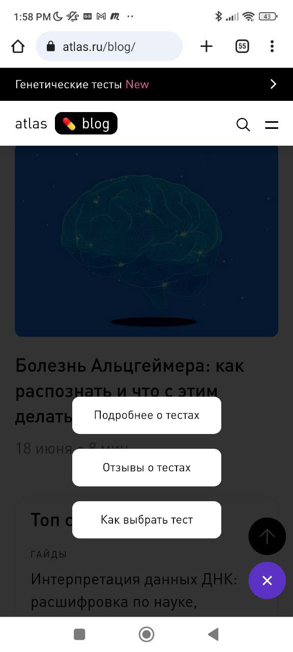
The result: Conversion increased from 2% to 20.
Skills applied:
- interviewing
- usability testing
- qualitative research
- prototyping
- Figma
- wireframing
- interviewing
- usability testing
- qualitative research
- prototyping
- Figma
- wireframing
Equipment:
Figma
Miro
Figma
Miro

